Chromatic Influence: The Psychology Behind Color Choices in Children’s Playground Rides
- Beston Amusement Rides

- Apr 21, 2025
- 4 min read
Color plays a pivotal role in shaping the emotional and cognitive experiences of children in play environments. Far beyond aesthetic appeal, the hues selected for children's playground equipment are crucial to their development, behavior modulation, and social interaction. Understanding the color psychology associated with these installations offers valuable insight into how design decisions influence young minds.
The Psychological Underpinnings of Color Perception
Color perception begins early in life. Infants begin to recognize colors within the first few months, and by the age of five, most children demonstrate preferences for specific hues. These preferences are not arbitrary. They are deeply rooted in neurological responses that evoke emotional, behavioral, and physiological reactions.
For instance, bright primary colors such as red, yellow, and blue are commonly associated with energy, happiness, and creativity, respectively. These hues are often integrated into indoor playground equipment to stimulate engagement and sustained activity. In contrast, subdued tones like soft blues and greens promote calmness and are typically used in rest areas or quiet zones within larger play facilities.

Red: The Catalyst of Kinetic Energy
Red is an inherently stimulating color. It activates the adrenal glands and raises energy levels, making it a potent choice for sections of the playground where dynamic activity is encouraged. Slides, monkey bars, and other fast-paced amusement rides are frequently designed in red to elevate excitement and increase physical exertion.
However, overuse of red can also lead to heightened aggression and sensory overload in young children. Designers must employ this hue judiciously, often combining it with neutral or cooler tones to balance its intensity.

Blue: The Hue of Intellectual Serenity
Blue is associated with calmness, introspection, and focused behavior. Incorporating blue elements into playground structures can facilitate learning and cooperation, especially in spaces intended for group activities or cognitive tasks. Its cooling psychological effect can counterbalance the overstimulation caused by more vivid tones.
Indoor playground equipment designed for sensory exploration or storytelling often features shades of blue to promote a tranquil atmosphere conducive to concentration and imaginative play.
Yellow: The Stimulator of Optimism
Yellow invokes warmth, cheerfulness, and mental clarity. It is frequently used in areas designed to capture attention and stimulate thought. Due to its high visibility, yellow is ideal for safety features, boundary markers, and transitional zones within a play area.
However, similar to red, an overabundance of yellow can lead to agitation, particularly in younger children. Strategic use is essential to harness its benefits while avoiding potential negative responses.
Green: The Color of Balance and Growth
Green fosters a sense of harmony and connection to nature. Its association with growth and renewal makes it a favored color in playgrounds that integrate natural elements or biophilic design. Green also enhances decision-making and reduces anxiety, making it suitable for spaces where conflict resolution or collaborative tasks are likely to occur.
This makes green an effective choice in both outdoor environments and indoor playground equipment, especially in multi-purpose or educational zones.
Purple: The Stimulus for Creativity and Fantasy
Though less commonly used than primary colors, purple provides a sense of mystery and imagination. It blends the energetic attributes of red with the calming influence of blue, making it ideal for spaces intended to encourage imaginative play, such as themed structures or fantasy-based amusement rides.
In carefully curated areas, purple can support role-playing activities, storytelling zones, and immersive installations where creative expression is the primary goal.
Orange: The Mediator of Social Interaction
Orange is a social color. It combines the vitality of red with the cheerfulness of yellow, generating warmth and approachability. Its use in communal areas encourages communication, sharing, and group participation.
Ideal for seating zones, interactive games, or areas designed for collaborative building, orange reinforces the social dimension of play, making it a valuable component in playground design focused on interpersonal development.
Integration of Color in Indoor Playground Equipment
Indoor playground equipment presents unique challenges and opportunities for color application. Unlike outdoor settings, where natural light influences perception, indoor spaces rely on artificial illumination, making color saturation and contrast particularly important.
Designers often employ high-contrast palettes to maintain visual interest in controlled environments. Vibrant colors enhance spatial navigation, helping children distinguish between different activity zones. This is particularly useful in modular playground systems that incorporate multiple play styles—climbing, sliding, building—within a single footprint.
Furthermore, color is used to address safety and inclusivity. Tactile paths, color-coded instructions, and visually distinct zones support children with varying needs, including those with visual or cognitive impairments.
Color in Amusement Ride Design
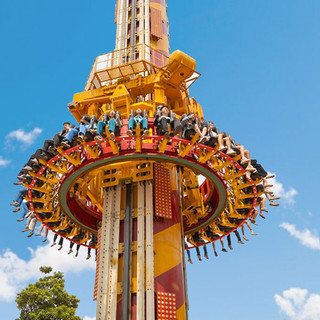
Amusement rides often serve as focal points within larger play installations. Their design leverages bold, eye-catching colors to attract attention and generate excitement. The psychology of thrill and anticipation is closely tied to the color choices here—reds and yellows dominate, enhancing the adrenaline-inducing nature of the experience.
Additionally, themed rides use color to deepen immersion. For example, a space-themed ride may rely on deep blues and silvers, while a jungle adventure might utilize a palette of greens, browns, and oranges. The cohesion between color and narrative enriches the user experience and supports imaginative engagement.
Conclusion
Color is far more than a visual element in the design of children's play spaces. It is a critical tool for psychological influence, behavioral guidance, and developmental support. When applied with intention and insight, color transforms playground equipment from mere structures into dynamic environments that nurture physical activity, emotional regulation, and cognitive growth.
Designers and planners must consider the nuanced impact of each hue, especially in the context of indoor playground equipment and amusement ride integration. A deliberate chromatic strategy not only enhances aesthetic appeal but also ensures that the playground serves its most important purpose: to foster safe, engaging, and enriching experiences for all children.


Comments